
Enhancing the streaming experience to convey entertainment
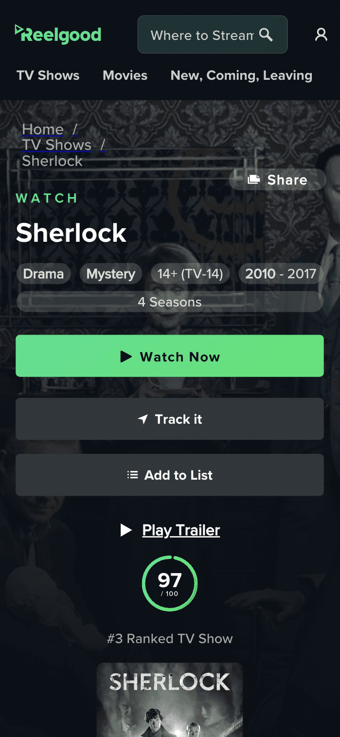
Reelgood's core B2C offering revolves around the title detail pages of its web app—movie, show, season, and episode pages serving as content hubs. These pages, totaling hundreds of millions, drive most of the site's traffic through long tail search queries like "Where can I watch X?" acting as the primary touchpoint for user acquisition and conversion.
Years of experimentation led to a cumbersome user experience full of one-off components, resulting in design and technical debt. How could we increase session duration and decrease the drop-off of new mobile users from search?
Role
Design strategy definition, conducting User Research, design implementation, and feature prioritization alongside with Product.
The problem
Solve Information Architecture and usability of large amounts of data while considering SEO, monetization, and conversion implications.
The company
Series A streaming guide with a discovery-based B2C experience and B2B data provider offering.
Audience segmentation
+1.5M monthly US visitors on TDPs during the last 30 days, with 70-30 mobile/desktop distribution.
The effects of SEO-led experimentation were noticeable:
Unclear hierarchy, confusing navigation, and usability problems
Years of 'featurization' of the title detail pages accumulated debt, affecting the grand majority of the users, who had never heard of the platform before, and this was their first experience.
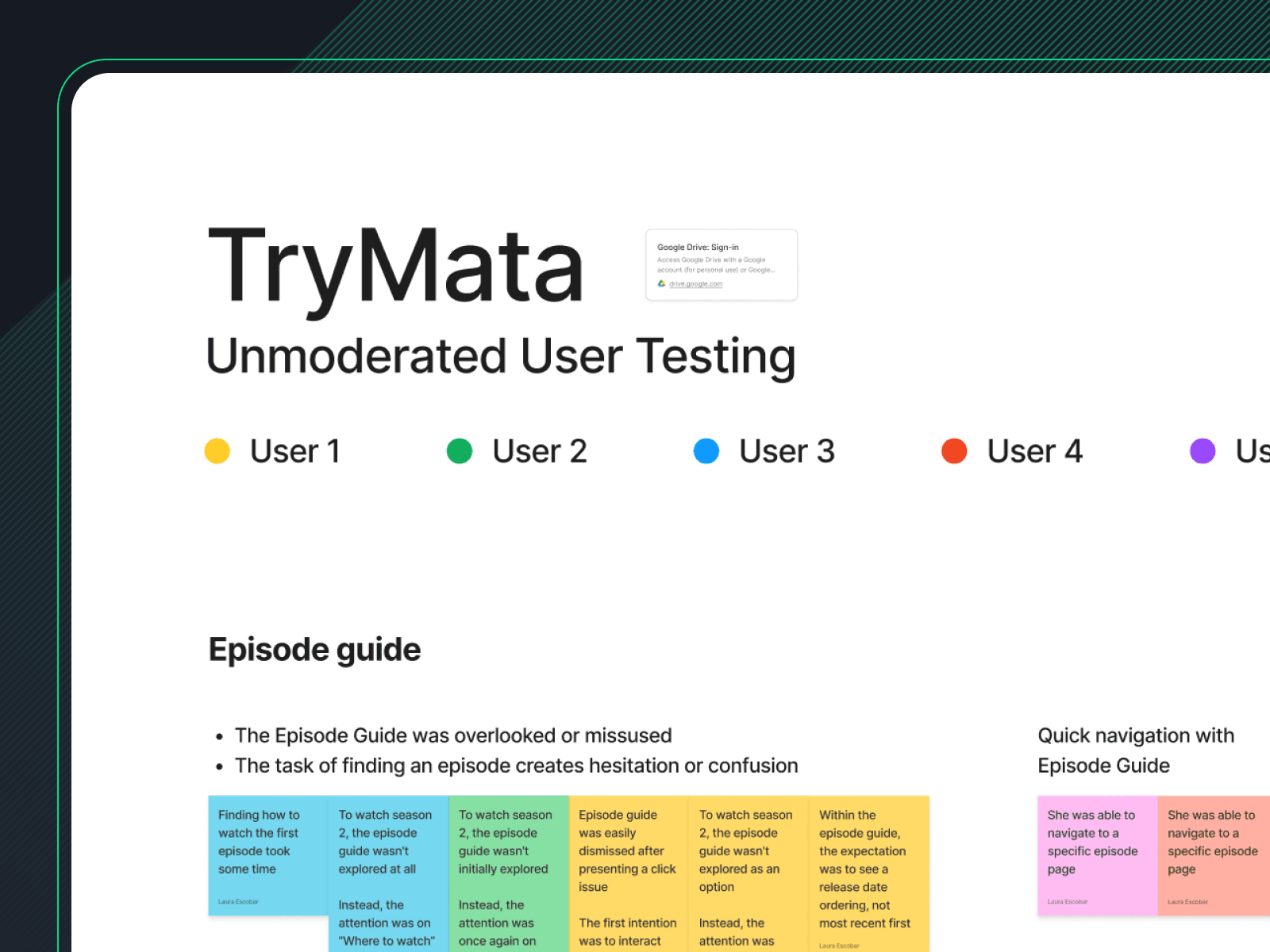
Uncovering friction and frustration with unmoderated testing
To better understand a new user's perception, I gathered feedback from first-time users.
The most common pain points were intrusive feature gates and difficulty in finding information.
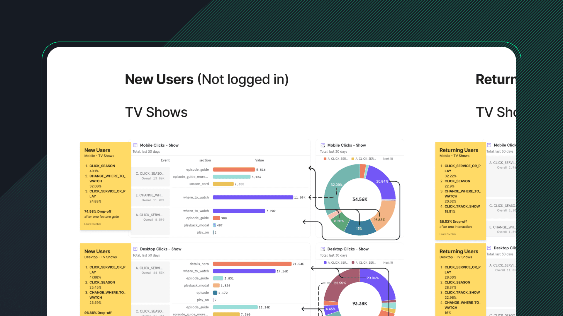
Quantitative Analysis highlighted the pain points and needs
Users were trying to find an episode easily, but the drop-off rate was exponential due to the feature gates.
Business goals
• Drive more traffic through SEO growth, leveraging unique content
• Improve CTR and engagement per session
• Increase Web to App (W2A) conversion on mobile web
User goals
• Improve discoverability and navigation of content in data-rich pages
• Reduce friction of known usability issues
• Build a strong brand perception, especially for new users
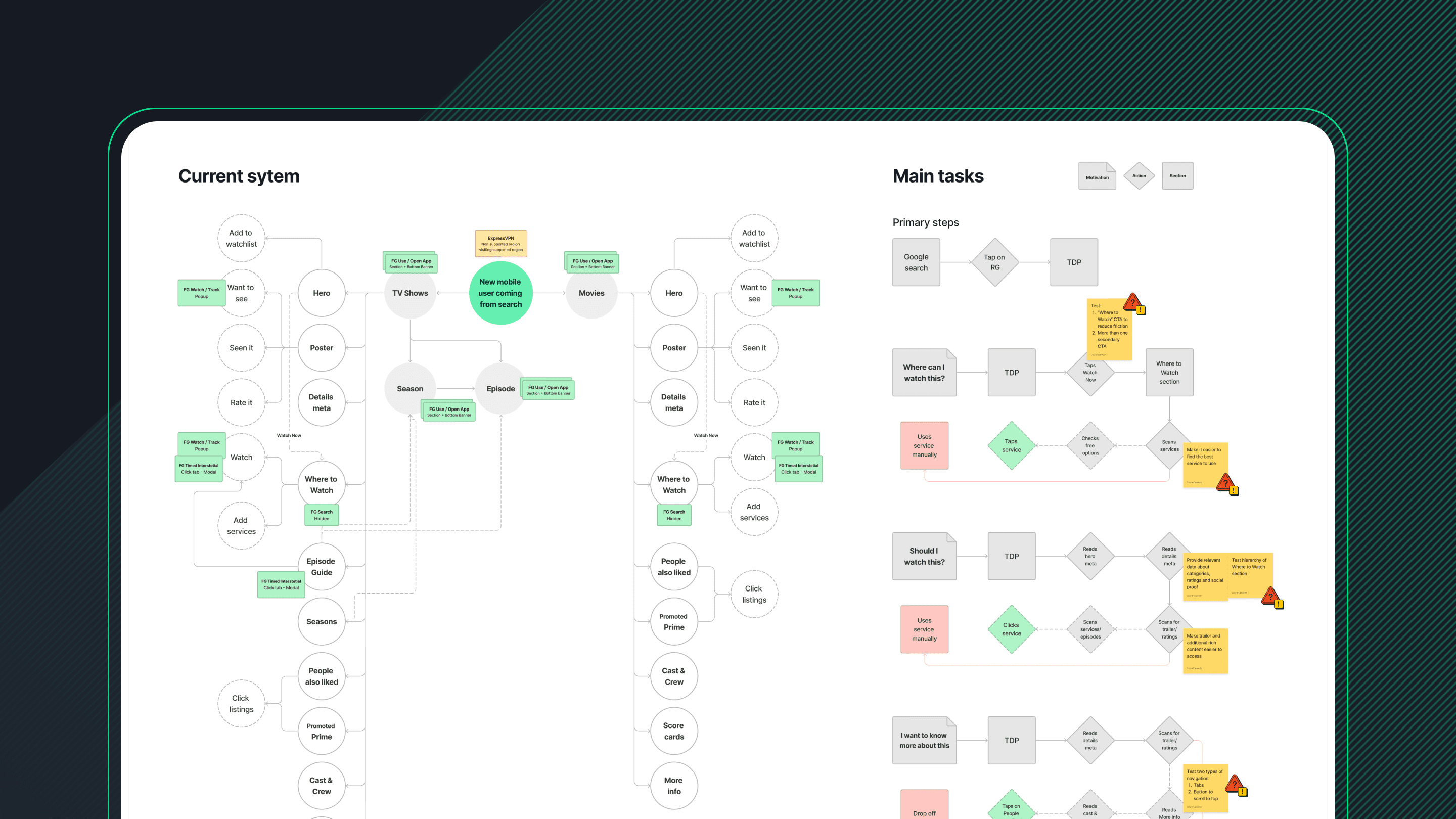
Mapping out the system to understand main paths and events
Updating the title detail pages was a big undertaking, so I needed to understand the shared mental models and how the information was interconnected.
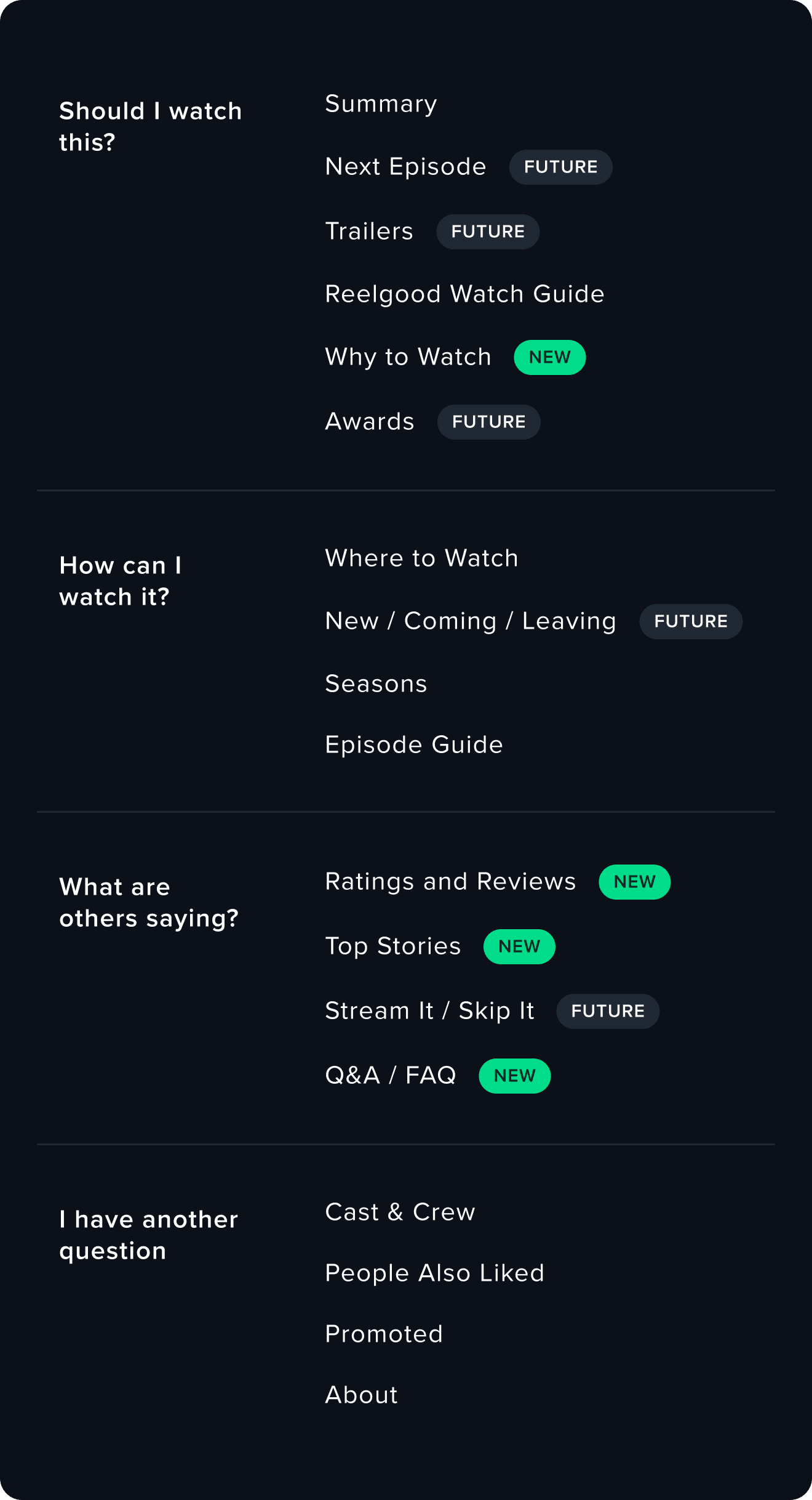
Prioritizing content hierarchy based on common intents
New and existing users visit the TDPs to solve a wide variety of questions, there wasn't a single intent to focus on, but rather multiple jobs to be done.
By clearly defining content sections based on a top-level intent, we could reduce the time needed to find relevant information and make decisions to the main questions:
Should I watch this?
Where do I watch this?
Visual lenguage exploration to define constraints
Experimenting with foundation systems and existing components enabled an open discussion between Product, Design, and Engineering to have a shared understanding of rollout strategy and technical dependencies.
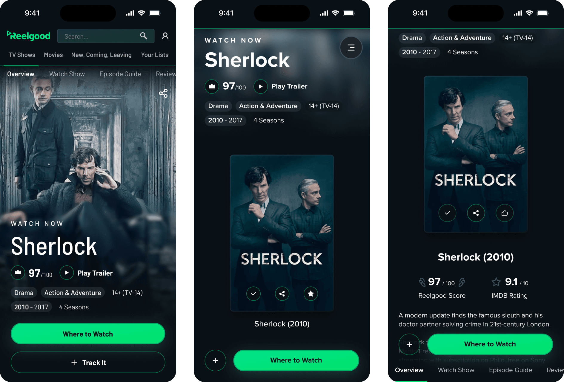
Ease of navigation to choose your own adventure
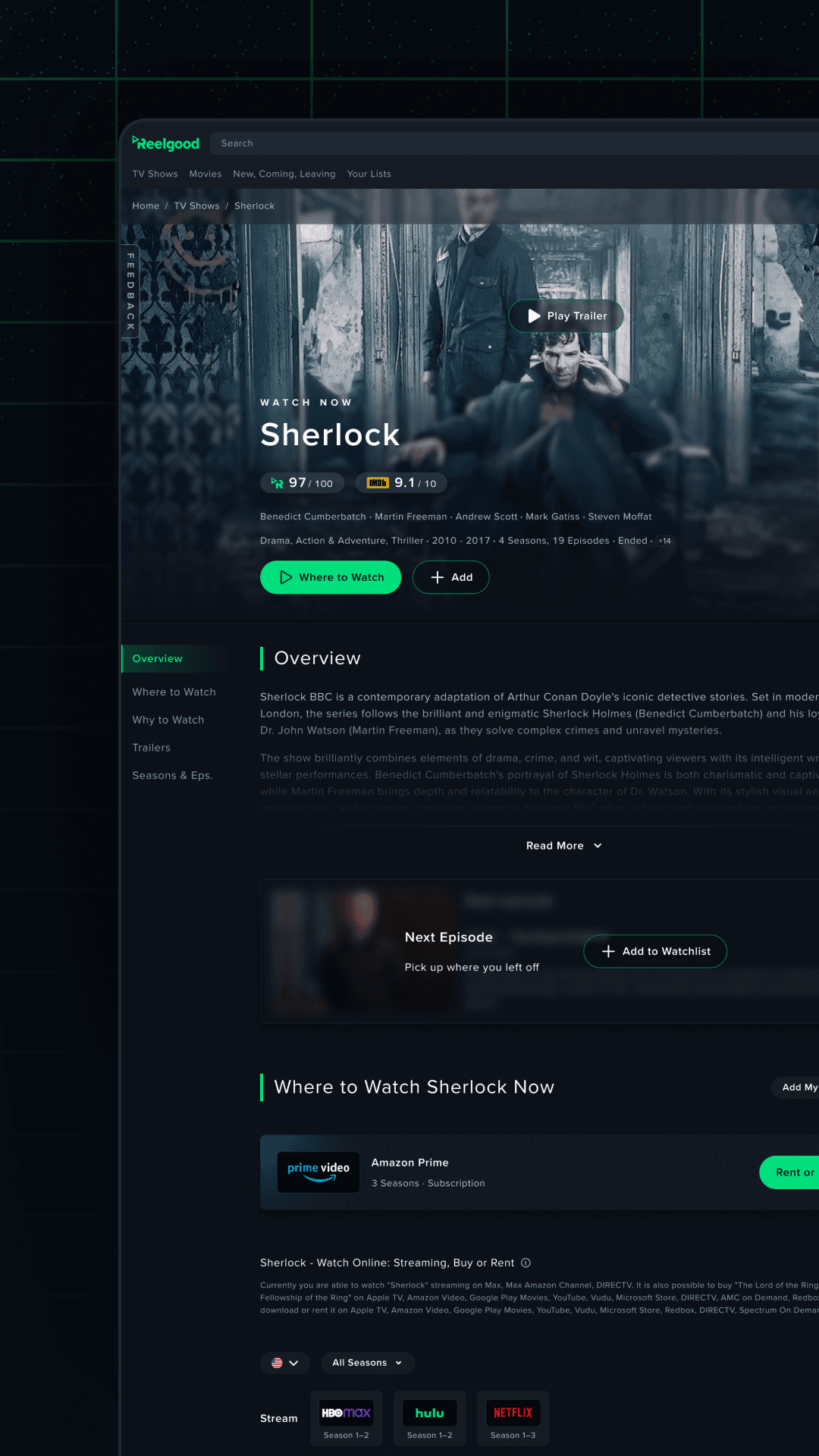
Removing sections of content was out of the question, but discoverability could improve by anchoring key sections to the page navigation.

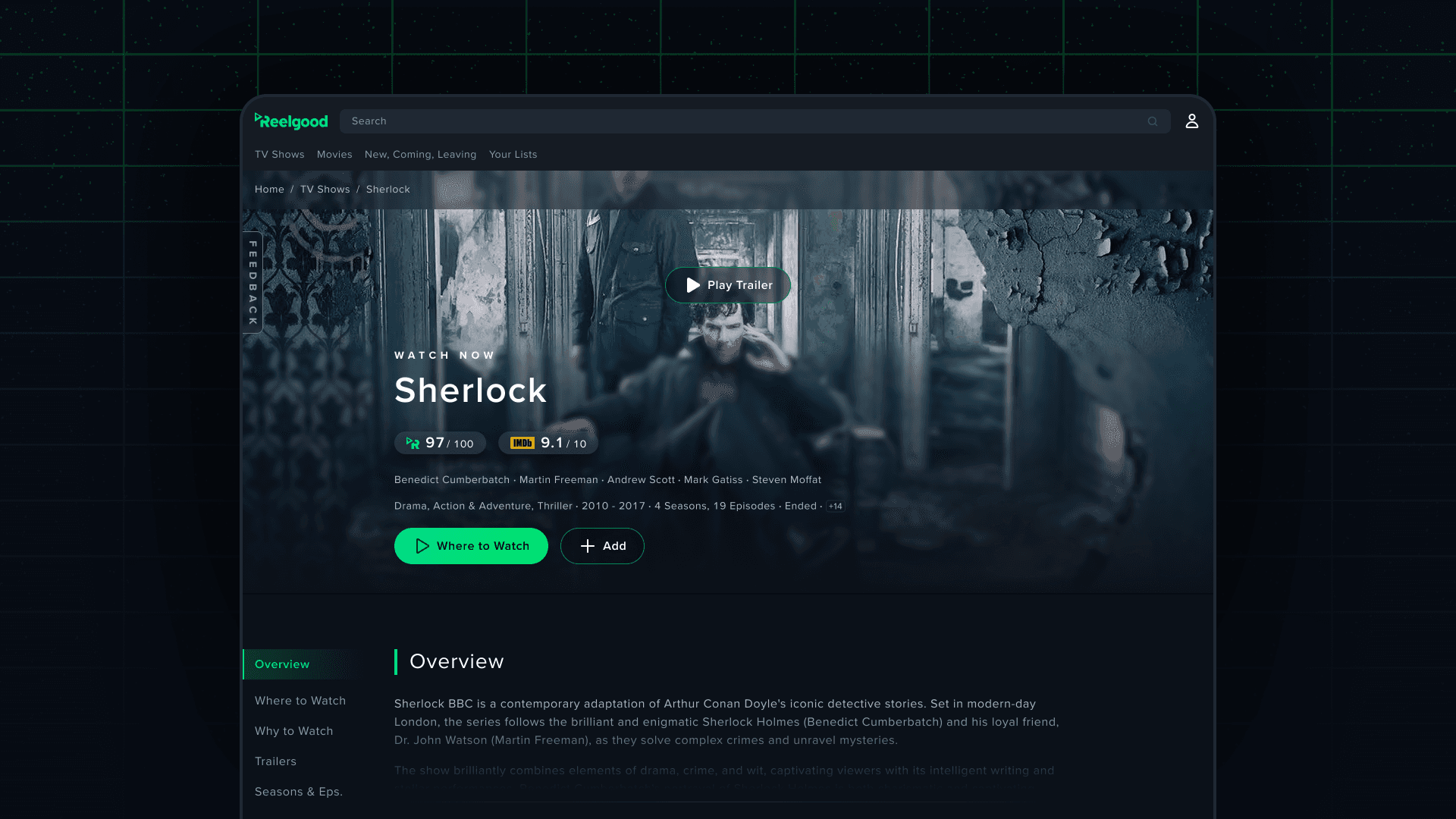
Improving the hierarchy of key metadata in the landing viewport
Information like the top-billed cast, number of episodes, and TV show status was buried under a long scroll or hidden in small text but was top-of-mind for new users.
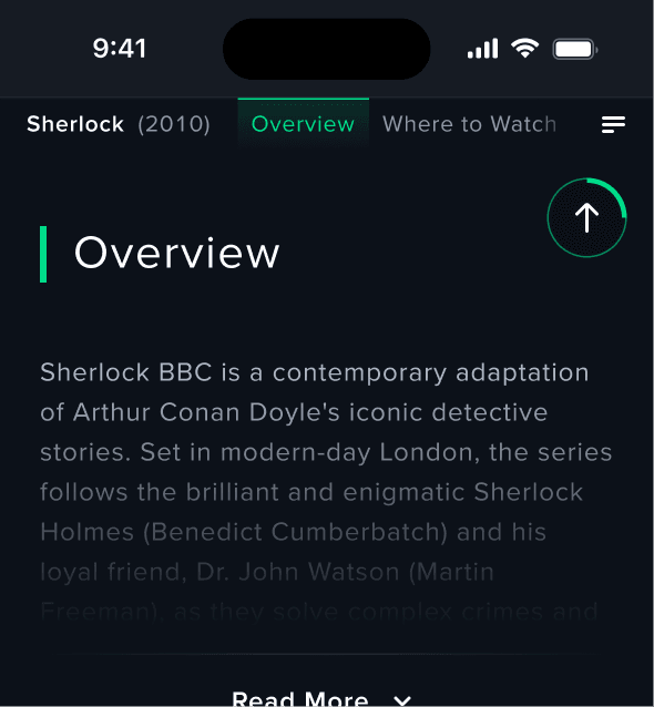
Reducing cognitive load with pattern consistency and data density
Previously, sections were unclear and blended due to lacking distinction, making discoverability slower for new users, especially on mobile.
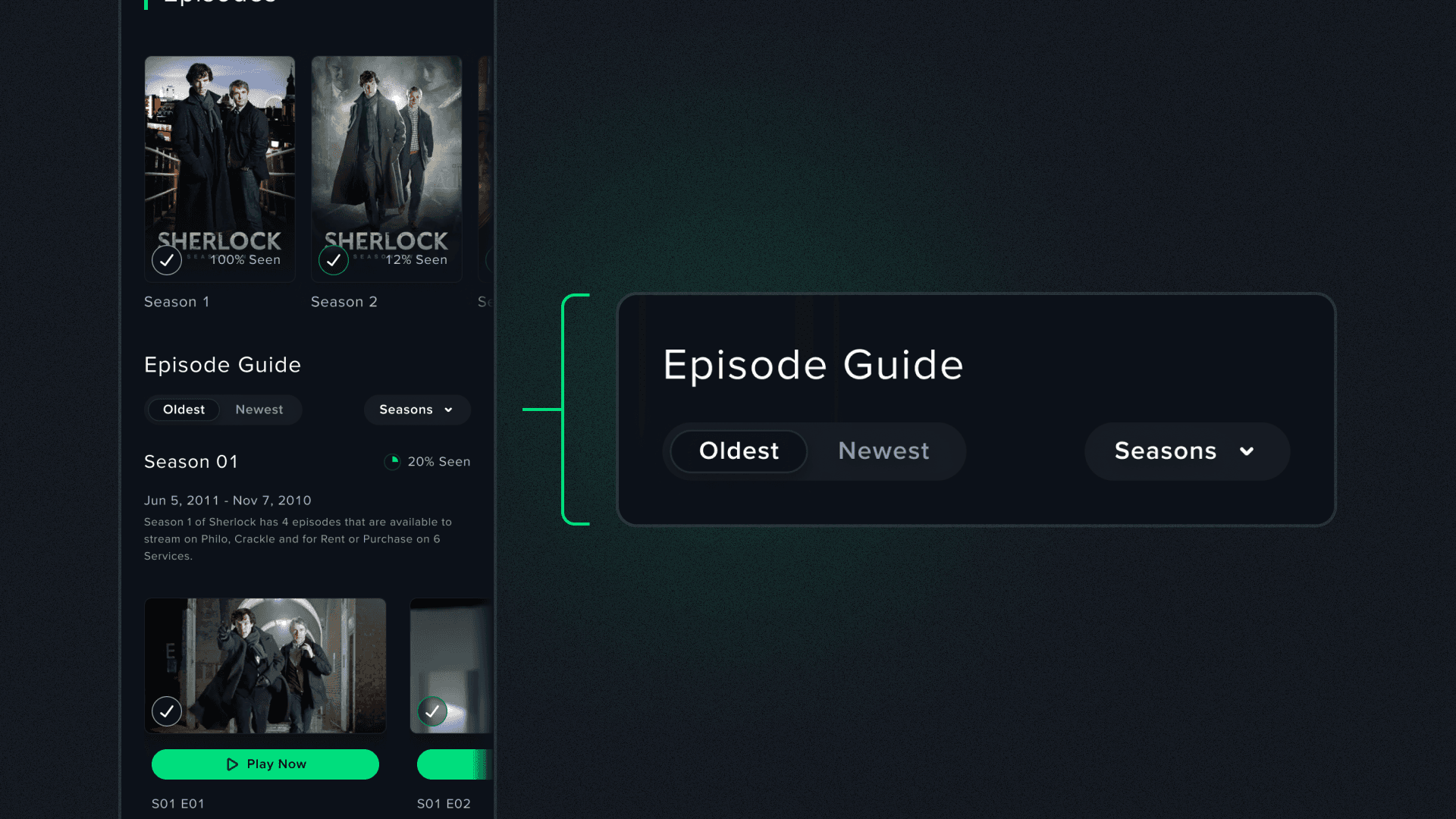
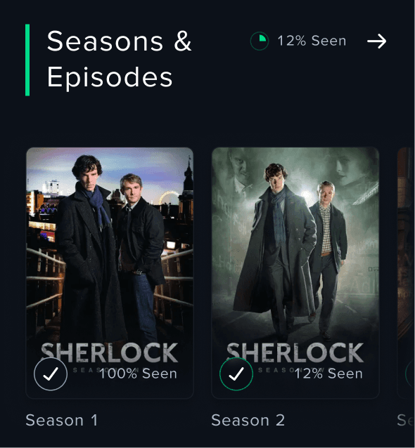
Compromising on season navigation to serve two use cases
Whether you were trying to catch up with the latest episode or starting a TV show from the beginning, moving away from tabs to sorting and season selection could solve both use cases without hurting one another.

Easier to find information + Consistent design = Improved experience
The effects of thoroughly reviewed Information Architecture and usability of components were noticeable in the User Testing, even within a single page.
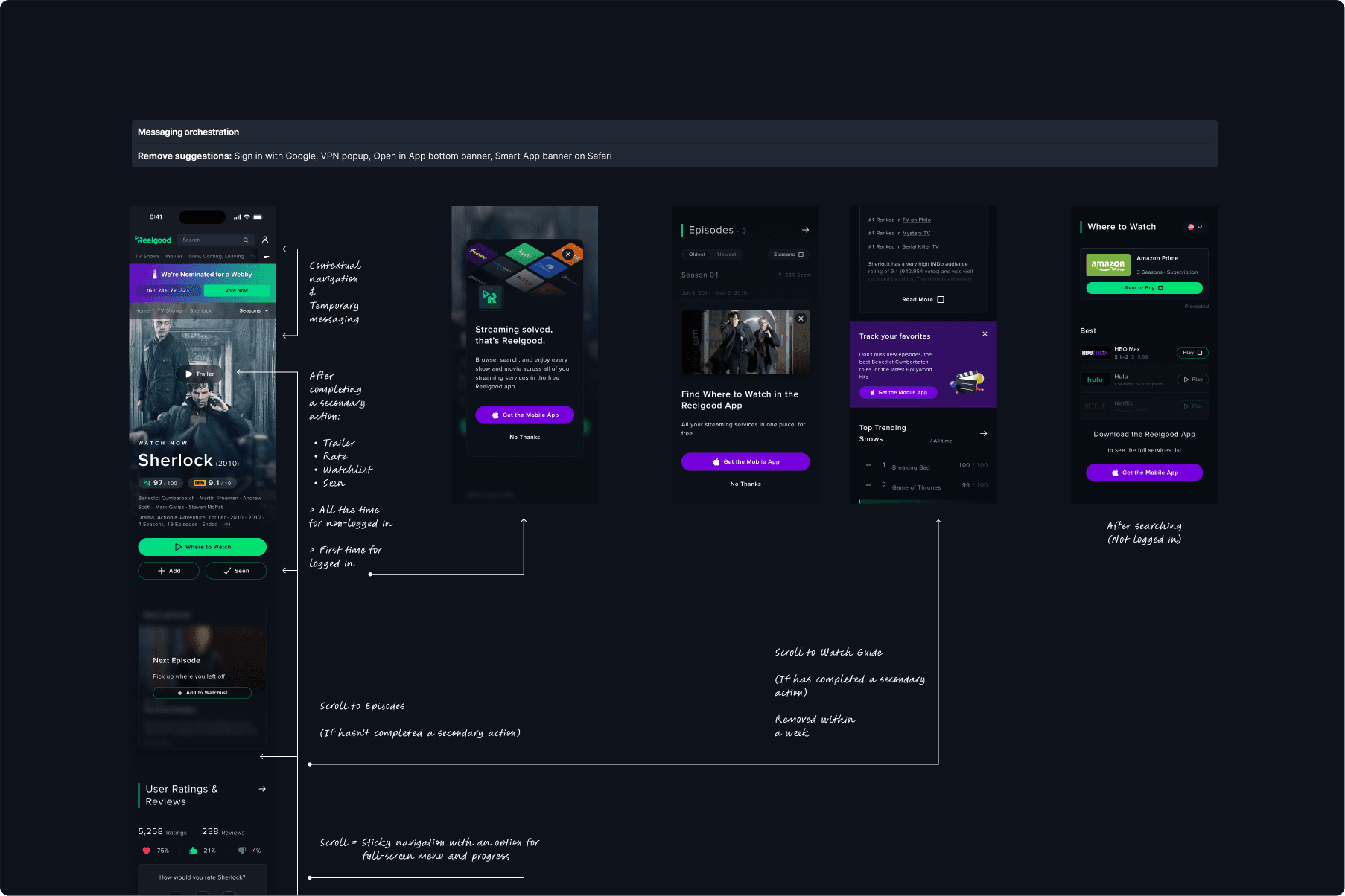
Revised feature gate orchestration
The effectiveness of the feature gates was reviewed in collaboration with Growth, creating a cohesive design and adjusting the timing of each prompt to increase the W2A CVR.
Timeline
04
months with half-time capacity
Scope
100M +
pages optimized
Forecast
20%
increase in CVR
Time on Task
5sec.
avg. time to find information
